Understanding the parts of an email
Email marketing is a powerful tool that can deliver on your investment if done right.
The median ROI (return on investment) is 122 percent, which is four times higher than any other digital marketing channel.
Let’s break down the key components of an effective email so that you can up your emailing game.
The sender email address
Who is your email coming from? That is your sender (from) address and it’s important that your sender address is clear and recognizable.
43% of user report emails as SPAM based on the sender name.
Identifies who your message is from
The from address field identifies who your message is from. This is probably common sense, but remember that you never want to leave it blank (so that the sending address is what shows).
Does the case of the email address matter? No, email addresses are not case sensitive.
Helps the recipient understand the purpose of the message
Choosing the right sender address helps the people receiving your email understand what the email is about. For example, below are two different emails:
Compared to:
The first from address conveys that the message is likely coming from the marketing team whereas the second message, whilst still sent to a larger group, implies a more personalized update.
Components of the from address field
The from address field is actually composed of:
- Name (DailyStory Team)
- Email address (hello@meetdailystory.com)
The format is name in quotes with email address in angle brackets:
"name here" <email address here>
Both of these fields should be used to convey important information to the recipient.
People are more likely open messages from people or organizations they trust.
You can read more about the format of an email address on the Email address article on Wikipedia.
Dynamic from address field personalization
A unique feature of DailyStory is the ability to use personalization to set the from address field. For example, if you want to set the name of the sender to the sales rep that the customer is working with.
The recipient email address
The sender address is who the email comes from. The recipient address is who the email is sent to.
An email address can also contain cc (carbon copy) and bcc (blind carbon copy) fields too.
Automation platforms set the recipient address automatically
In a marketing automation platform, such as DailyStory, the recipient address is typically set dynamically as each message is sent.
When possible the recipient email address will be “Fullname” <email address>. Where Fullname is the full first and last name of the recipient and email address is the email address of the recipient.
Email Subject
The right subject line can entice your recipients and increase your email open rate, which is definitely the goal.
The subject line is one of the most important parts of the email. It is the number one factor in determining if your email is read or immediately deleted.
Use personalization in your subject line
It’s also really important to use personalization in your email subject line.
Remember who your audience is, the point and goal of your message and what urgency you can build upfront.
Be clear and concise
Clear, concise language with action words without being too long is ideal.
What is the ideal subject line length?
Ideally your subject line is between 10-60 characters. But a shorter subject line is ideal.
Preview text
The preview text is the text shown by the email client (Gmail, Outlook, etc.) in addition to or after the subject line.
The sender address, subject line, and preview text should complement one another.
Preview text example in Gmail
For instance, think of Gmail. When you get an email notification, you’ll see who the message is from, the subject line and your preview text.

Always set a preview text for your emails. Emails with a well written preview text have a higher open rate.
How the preview text is created
Email clients generate preview text from the body of the email. Taking the first 35-90 non-HTML characters.
For emails between individuals, this will feel natural. But for automated marketing emails, the autogenerated preview text can be problematic.
For example, if the header section of your email body starts with, “View this email as a webpage”. That is what will also be reflected in the preview text in the inbox.
Set your own preview text
More advanced email marketing platforms, like DailyStory, allow you to configure the preview text.
Preview text should generally be between 35 and 90 characters. Some email providers may show up to 140 characters, but there also are email clients that don’t display any preview text.
Keep the preview text between 35 and 90 characters.
Nonetheless, it’s a best practice not only to fill out the preview text field, but use it as an opportunity to convince your recipient to open your email.
More opportunities for personalization
Just like the subject and body of the message, you should also consider using personalization in the preview text.
Use personalization in the preview text to increase open rates.
Altogether, the “From,” subject line and preview text combine to create a package for the recipient. You want all three to complement each other and tie together to convey a need to open your message.
Next, let’s look at the component of the email message body.
Salutation – the opening greeting
This is the top part of your email. Typically, it should feature recognizable elements like your logo and brand colors.
Using your logo and colors consistently helps build trust with your audience. Utilizing an AI logo generator can further enhance your brand’s identity and ensure a professional look. By maintaining consistency and leveraging advanced tools, you can create a memorable and trustworthy image for your audience.
Example of the email salutation
In the example below Nissan uses the header area of the email to re-enforce the brand and the promotion. You know exactly who the email is from and what it is about:

Email Body
The email body content is commonly considered “the meat” of the email and for good reason. While the subject line is important, the email body is where your content lives. It is the most important part of an email.
This is your space to make the “conversion magic” happen, to engage your email recipient. It’s the primary space for your messaging.
Use both text and media in the email body
Don’t just use images in your email, as not all email clients will show images by default – hey Microsoft Outlook we’re talking about you!
Instead, include a mix of images, text and colors to ensure you email renders effectively in all the inboxes. You should also consider using a seed list to test your emails.
Don’t just use images for your body content. Email clients like Microsoft Outlook won’t render images without user interaction.
How the body looks has infinite possibilities, but remember your goal.
A newsletter, for instance, is going to be designed differently than a product-release announcement.
Include embedded videos in your email
If a longer email, you want to visually break up the text enough to keep the reader going. If a shorter email, perhaps visuals can tell your story. And consider using video in your emails too.
Technically videos cannot be embedded in emails. Platforms like DailyStory will automatically replace the embedded video with a clickable image.
Call to action
This is largely part of your email body (but could expand to your subject line and/or preview text, depending). What do you want the recipient to do?
The call-to-action (or CTA) is a needed component for any medium of marketing, not just emails.
Just like with your subject line, you want to be clear, concise and direct.
Example of a good email call to action
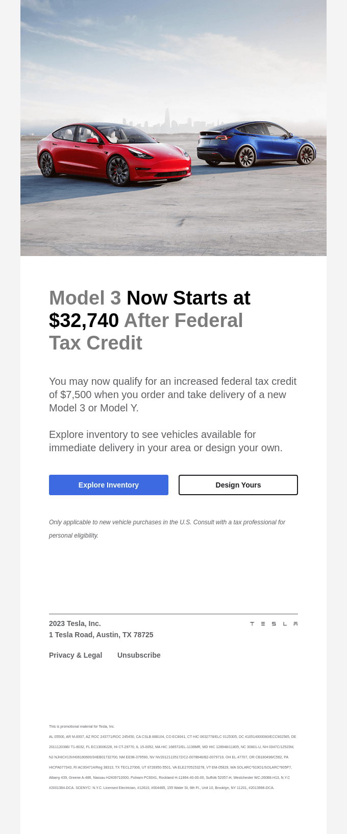
Below is an example of an email from Tesla with a simple, clear call to action: buy now and save money with a $7,500 federal tax credit.

Images and other visuals
There’s almost nothing worse than when designers realize that images might not automatically render correctly (or at all) for all recipients.
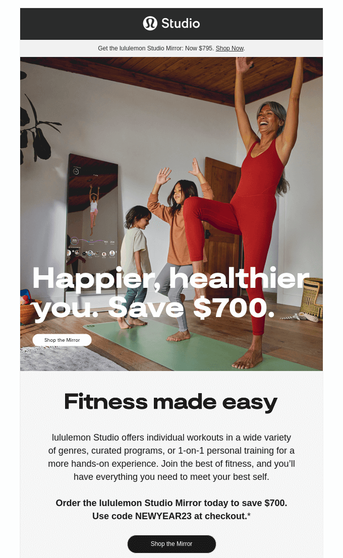
But adding images to your email helps conversions. Check out this email from Lulu Lemon – it’s a great example of how visuals in the email can speak to the audience:

Leverage visuals for brand consistency
Whether it’s a preferred user setting to block image downloads in emails (a security measure) or some email clients (like Microsoft Outlook) rendering images and designs a little differently, it’s important to craft your email body in such a way that still makes sense even if the images are off.
Don’t forget to set the alt text and dimensions of your image
And you should design your email with alt text for the images to handle cases where the client doesn’t show the images.
The email footer: final words
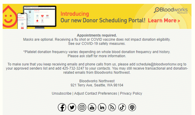
This area typically includes the unsubscribe link (with an additional “change email preferences” link if applicable), as well as additional contact options (like a mailing address and/or phone number). Any disclaimer text can go here as well.
But the footer can do even more than that. You could have a footer image to convey one last element of your marketing message.

Social media and other links
It’s a missed opportunity not to include the links to your social media accounts in your email. Use social media logos as links because of their recognition factor.
Other links could include downloading your app from the Apple or Google Play stores, for example.
These links are traditionally located toward the bottom of the message, below the bulk of the body.
Advanced email topics
In addition to the above topics regarding email parts, it’s possible to get even more advanced with the use of different mime-types for the body of your message.
If you want to explore these topics we’ve included some links to these articles below:
- Using Google AMP for email
- HTML of Plain Text
- Avoid using a noreply email address
- How to avoid the SPAM folder
DailyStory makes building beautiful emails easy
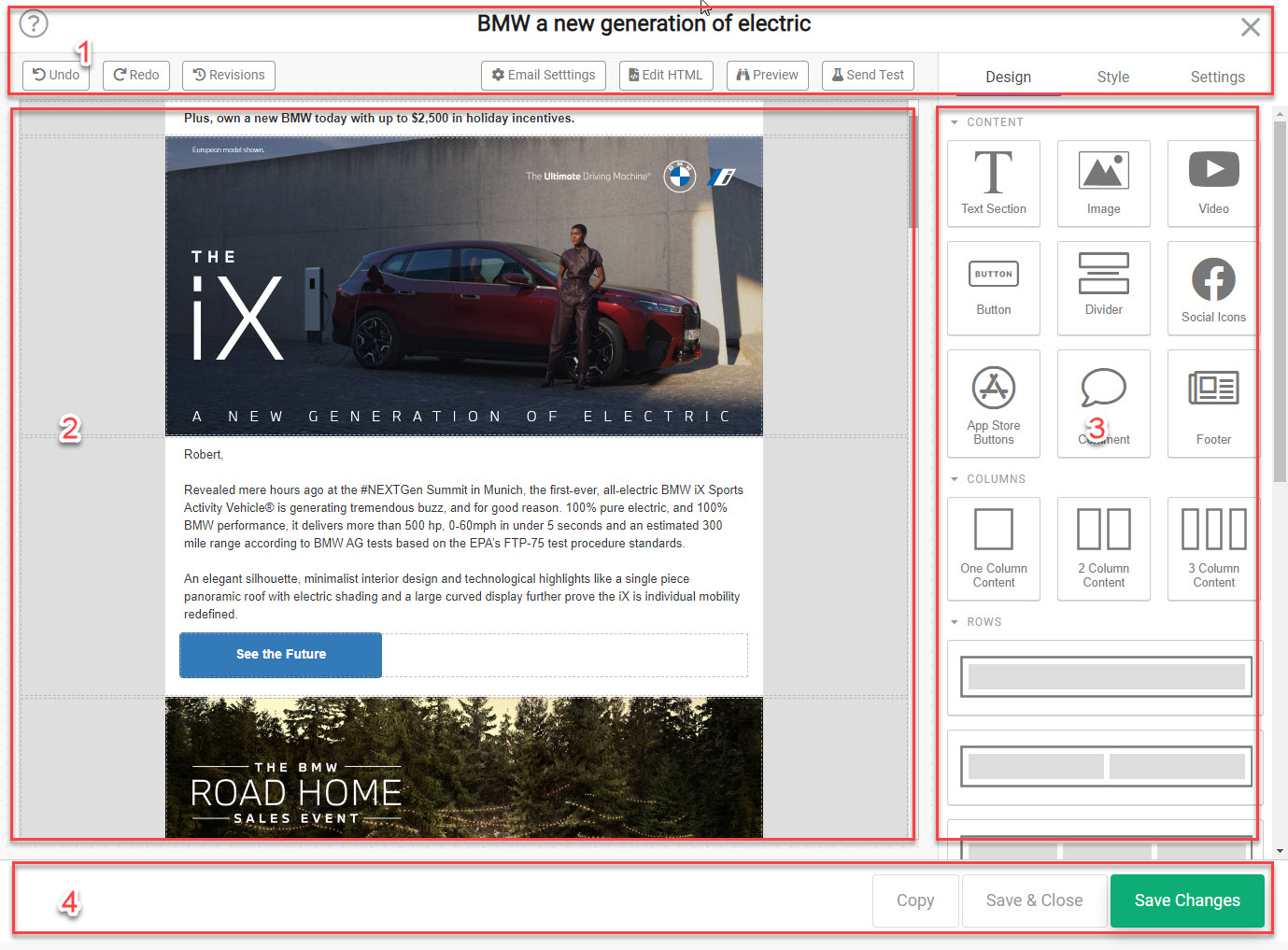
DailyStory makes building email easy with our user-friendly drag-and-drop email designer. You can start with one of our pre-built templates and you’ll have your first email sent within minutes.

Conclusion
Always view every part of an email as an opportunity, and be sure to measure your performance. What performed well? What didn’t? Can A/B testing be used to gather further actionable insights?
For inspiration, check out some of these examples from Really Good Emails.

